A One-Page Brief That Gives Every Detail a Place
A one-page brief layout separates the central question, essential facts, and supporting detail so readers can find the decision, context, and next move quickly.
The most common mistake in a one-page brief is shrinking every paragraph until it fits. The page may technically hold the material, but the reader pays in scanning time: the main question, a necessary fact, and background detail all compete at the same volume. A better one-page brief layout gives each kind of information a distinct reading level before you adjust the design.
Start with the question the page must answer
Write the central question in plain language before opening a layout tool. It might ask which audience to serve, what change to make, or what a team needs to decide. Keep it narrow enough that the page can answer it without turning into a project history.
Place that question where a reader encounters it first, usually near the top. A short title can name the subject; a nearby sentence can state the decision or purpose. Avoid a title that only names an initiative if the reader still has to infer why the brief exists.
Then check whether the rest of the page serves that question. A fact belongs in the main reading path if it changes how the question should be answered. If it merely explains how the work began, it may belong in a quieter supporting area—or nowhere on this page.
Separate essential facts from supporting detail
Essential facts are the information a reader needs to understand the question and judge the available direction. Depending on the project, these may include the audience, constraint, current condition, intended outcome, decision owner, or next action. Choose only the facts that perform a distinct job; several lines that all provide general context can often become one precise statement.
Supporting detail adds useful texture without carrying the argument. It might include a short source note, a definition, a secondary consideration, or a compact explanation of an assumption. Keep it available, but make it visually quieter through placement, shorter wording, or a smaller heading level—not faint text that becomes hard to read.
A simple sorting pass helps. Mark each draft item as “question,” “essential,” or “supporting.” If an item could fit two groups, ask what the reader would lose if it moved down one level. If the answer is “the page would still make sense, but with less context,” it is probably supporting detail.
Build the page as three reading levels
Think of the page as a route, not a container. A reader should be able to grasp the purpose, scan the necessary facts, and then dip into supporting detail in that order. The visual hierarchy—differences in position, size, weight, and grouping—makes that route visible.
- First level: the central question or decision, stated clearly.
- Second level: the essential facts, grouped under descriptive labels.
- Third level: qualifications, definitions, or background that support the main reading without interrupting it.
Use position and spacing before decoration. A clear title, a few aligned text blocks, and consistent gaps can establish hierarchy without colored panels or elaborate rules. If you use color, reserve it for a meaningful distinction, such as separating a proposed action from a constraint, and preserve enough contrast for comfortable reading.
Grouping matters as much as font size. Keep a label close to the facts it names, and leave more space between separate groups than between related lines. A reader should not have to guess whether a note belongs to the section above or below it.
Fit the content by editing, not squeezing
When a draft runs long, first remove repetition and replace vague phrases with specific ones. “Several concerns were raised about the current process” may be less useful than naming the relevant concern directly. Prefer short labels and compact sentences, but keep enough context for a statement to remain accurate when read on its own.
Next, test whether supporting detail can move to a footnote, linked attachment, or follow-up document. A link is useful only if the one-page brief still makes sense without it. Do not hide an essential caveat in an external file just to preserve a tidy page.
Only after editing should you adjust the layout. Try a second column for related facts, or a narrow side area for supporting notes, if the reading order remains obvious. Avoid forcing the page into equal boxes: equal shapes can imply equal importance even when the content has different jobs.
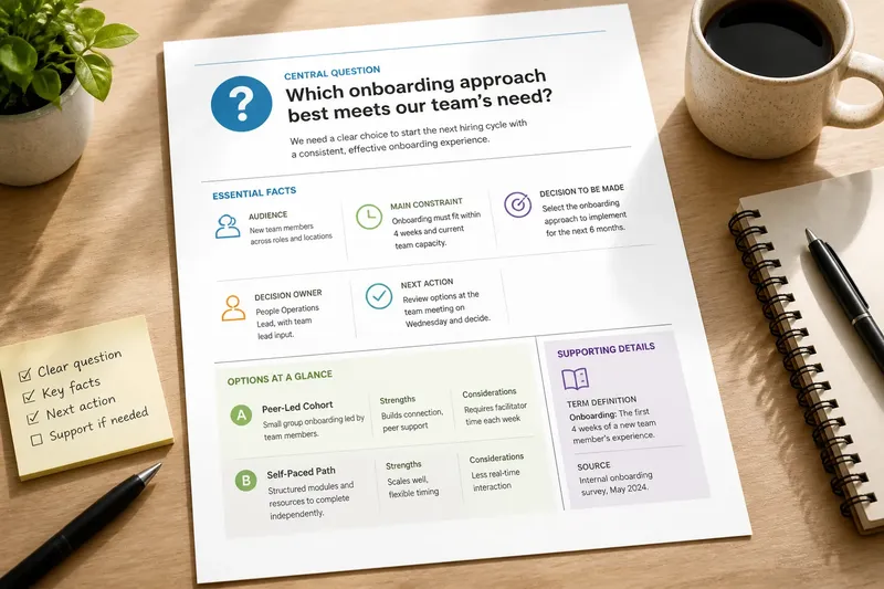
Say you are preparing a brief for a team choosing between two ways to onboard new members. The central question is which approach best addresses the team’s stated need; the essential facts name the audience, the main constraint, and the decision to be made. A note defining an internal term sits in a small supporting section. The expected result is that a reader can identify the decision first, compare the relevant facts, and consult the definition only if needed.
Check the one-page brief layout from a reader’s path
Review the page at its intended size, not only while zoomed in on a screen. Ask someone unfamiliar with the draft to point to the central question, the facts that shape the decision, and any supporting notes. Their route through the page can reveal a misplaced heading or a detail that looks more important than it is.
- Can the purpose be understood from the title and opening statement?
- Are essential facts visibly distinct from background?
- Does each heading describe the information beneath it?
- Can a reader tell which notes belong together?
- Is any small text doing work that should be given clearer space?
- Does the final action or decision have a visible place?
Do not spend time perfecting tiny decorative details while the reading order is still unclear. A subtle border or custom icon rarely solves a hierarchy problem. Fix the order, labels, and grouping first; polish only where it helps readers distinguish information.
Questions readers ask about one-page briefs?
What belongs at the top of a one-page brief?
Put the subject and the central question or decision near the top, so the reader knows why the page exists. Add only the context needed to interpret that question.
How many sections should a one-page brief have?
Use as many as the content needs to separate distinct jobs, but avoid headings that split one small idea into fragments. A few well-named groups are easier to scan than a long chain of tiny sections.
Should supporting detail be removed to keep the page short?
Remove detail that neither changes the decision nor helps interpret an essential fact. Keep a qualification or definition when leaving it out would make the main statement misleading or confusing.
What if the brief still does not fit?
Reconsider the scope before reducing type size or spacing. The page may be trying to answer more than one central question, in which case a second brief or an attached reference document may serve readers better.
A one-page brief works when its limits are visible: the question leads, essential facts support it, and context remains available without taking over. Keep that order intact as the page changes, and the one-page brief layout can stay useful even when details move or the decision evolves.